Virtuoso Travel
B2B Dashboard Redesign
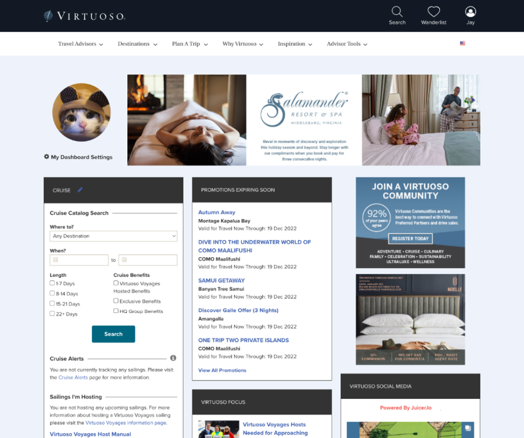
The existing dashboard:
The problem:
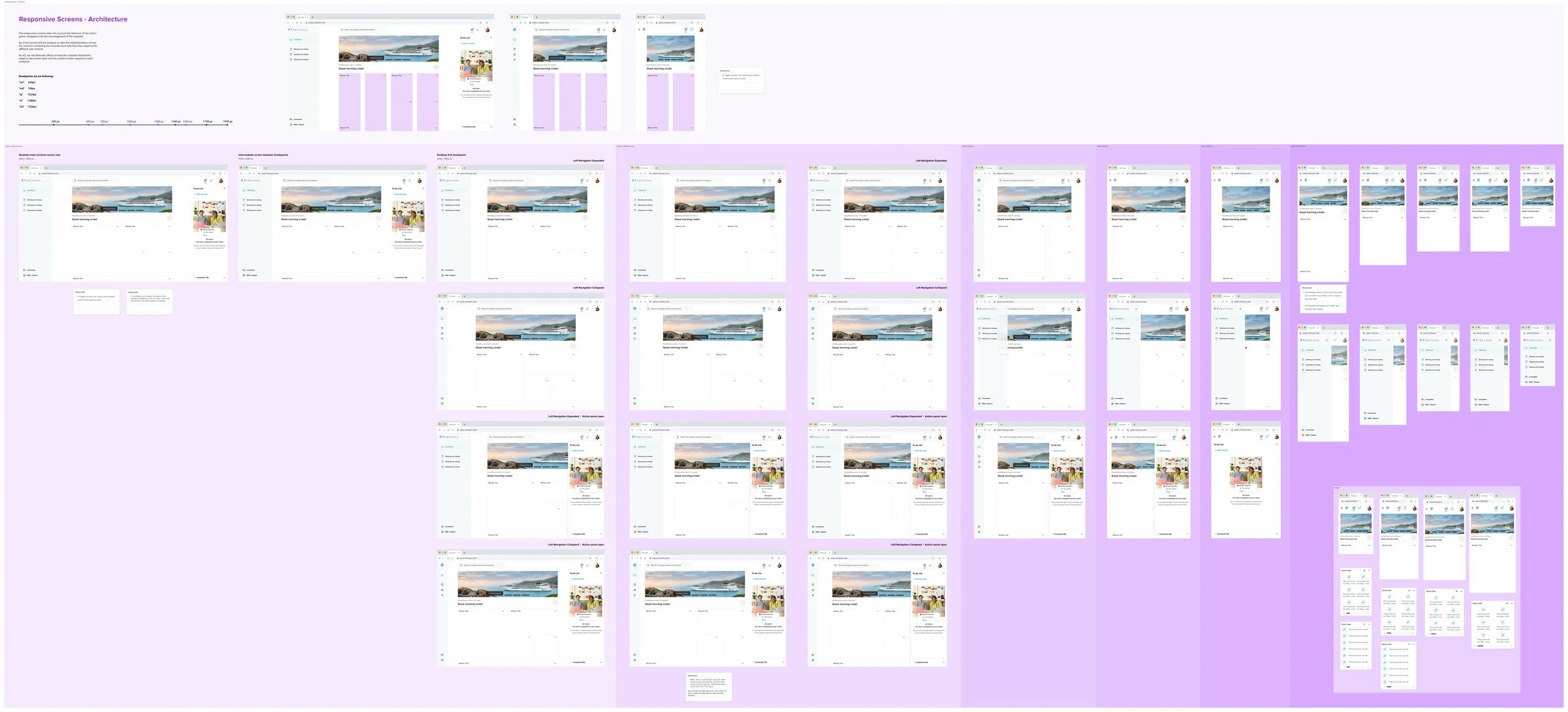
Existing dashboard not responsive
Confusing navigations
“I can’t find what I’m looking for”
“Emails, emails & more emails” - Virtuoso heavily relies on emails to communicate with their network, resulting in the network being inundated with virtuoso notifications, which drove down engagement, requiring even more emails.
Role: Product design lead
Research findings:
Search is very important and needs a complete revamp
Customization is key
Don’t replace users’ existing workflows
“Only show me the information that’s relevant to me.”
1. Dashboard structure definition
After analyzing the UX workshop for communications, we found out that the first layer of communication with our users should be the dashboard itself. However, the organization of its components should be completely redesigned to ensure users can find the information when they need it.
As a final result of our exploration and design proposals, we arrived at this structure:
Left Navigation: related to our products
Top Navigation: for search and user-related information
Right section: where all action required/actionable information is located
Center section: the dashboard itself, for view-only information
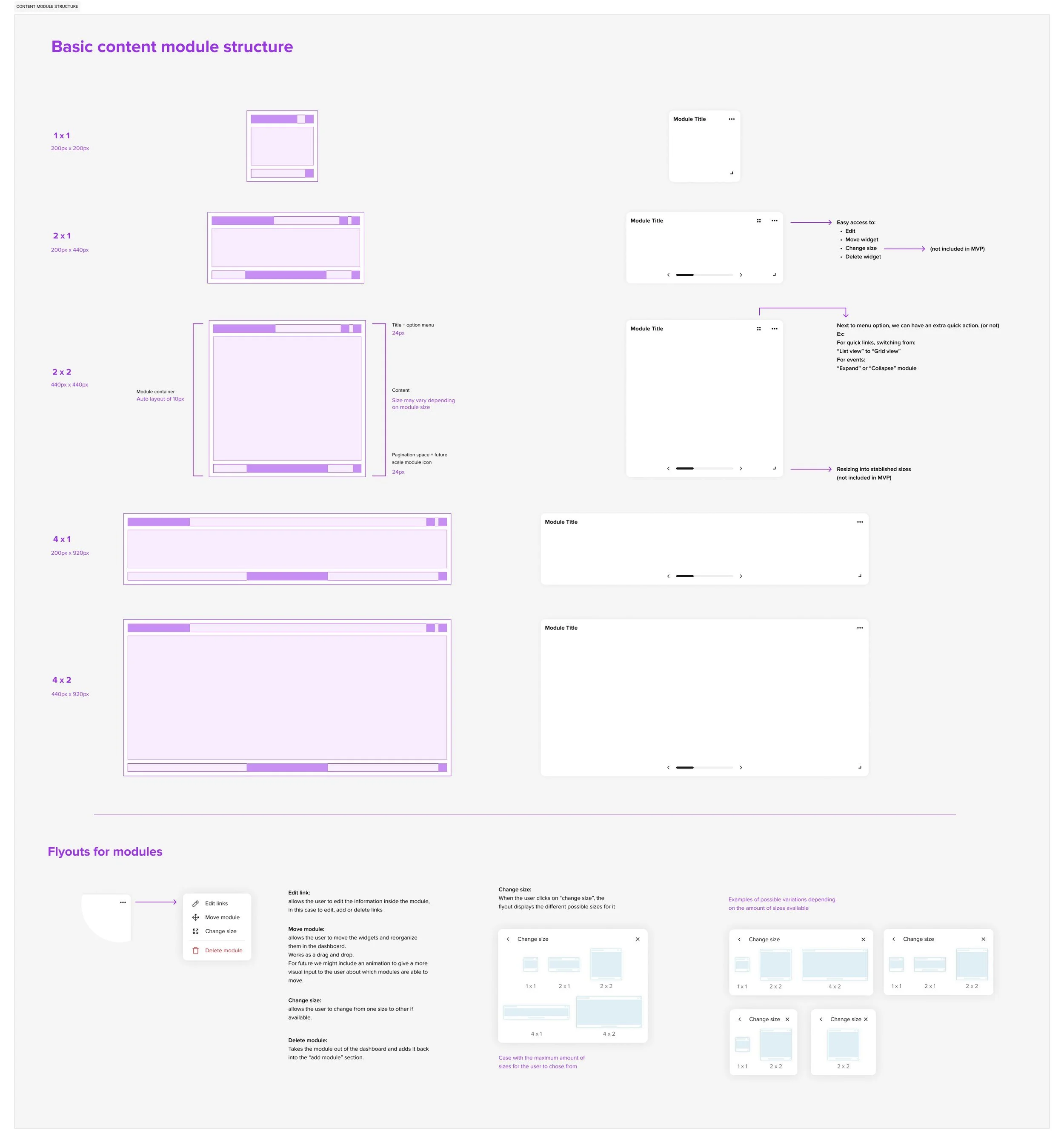
2. Modules Definition


